
Header, split
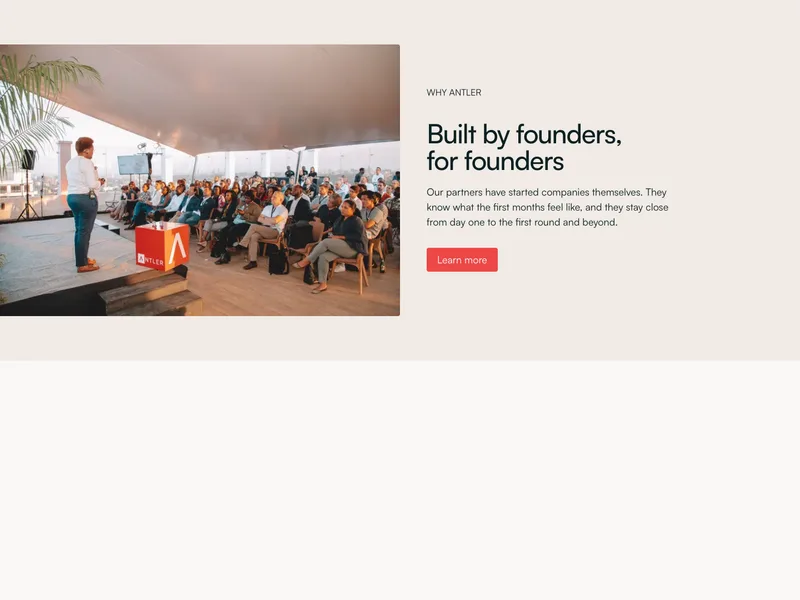
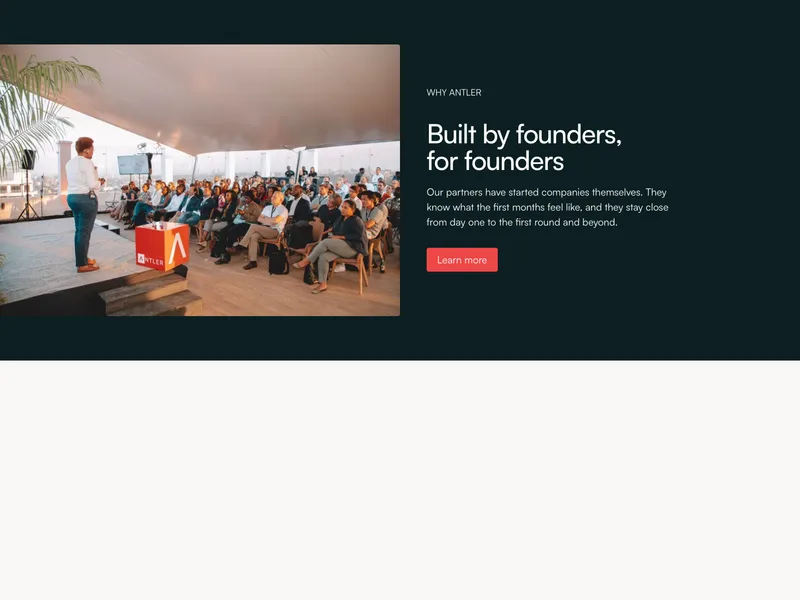
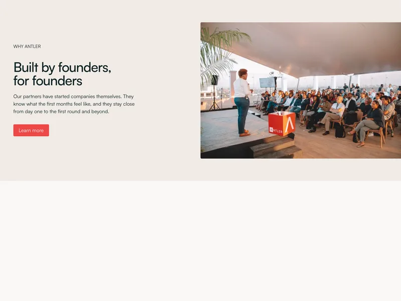
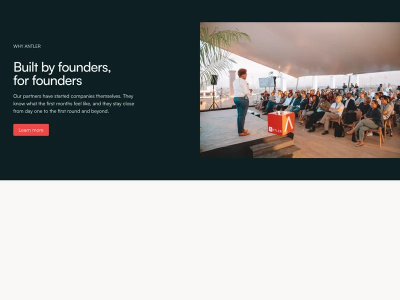
Headline, text and buttons beside an image.
Copy a section and paste it into your Claude Code chat.
Headline, text and buttons beside an image.


Headline and text left, buttons right, over a wide image.

Centered headline, text and buttons over a wide image.


Headline left, buttons right, over fading city photos.

Headline, text and buttons over a full-screen photo.


Blog header with one lead post and three more beside it.


Headline, text and buttons over a portfolio slider.

Headline, text and buttons over a full-screen video.
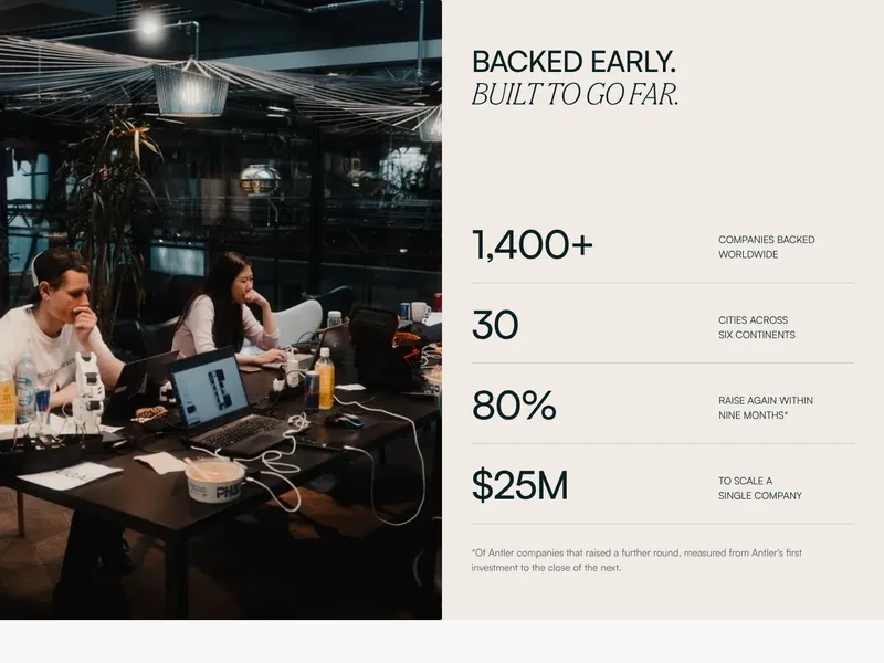
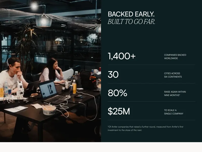
A full-height photo beside a heading and ruled figures.


A heading that holds while features scroll past it.
Four columns, each with a title, image and text.


A heading over four columns, each an image, title and text.
A heading over six principles, each a title and a line.
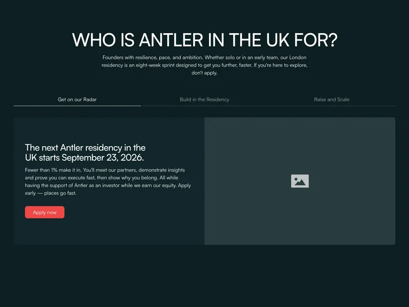
Three tabs, each with text, a button and an image.
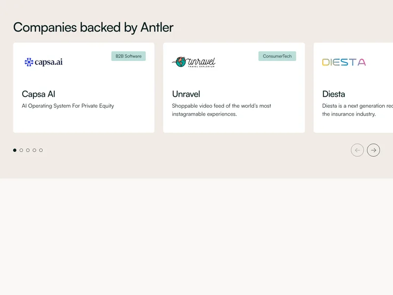
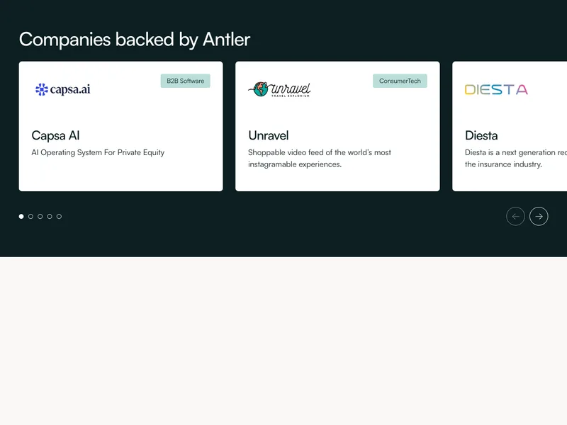
White company tiles with logo, sector and one-liner.
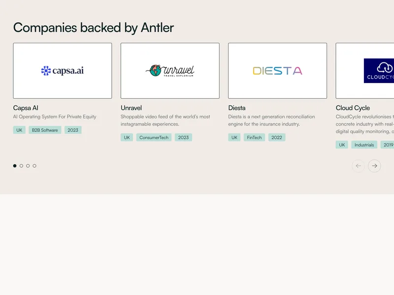
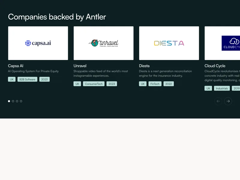
Company cards with logo, one-liner and tags, in a slider.
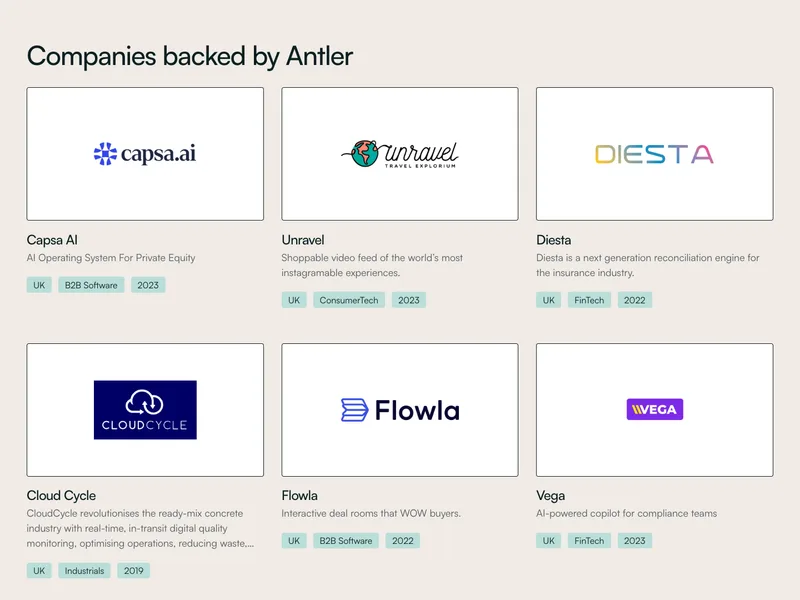
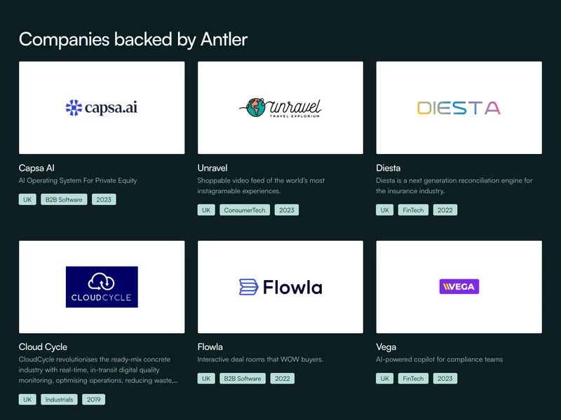
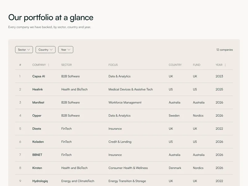
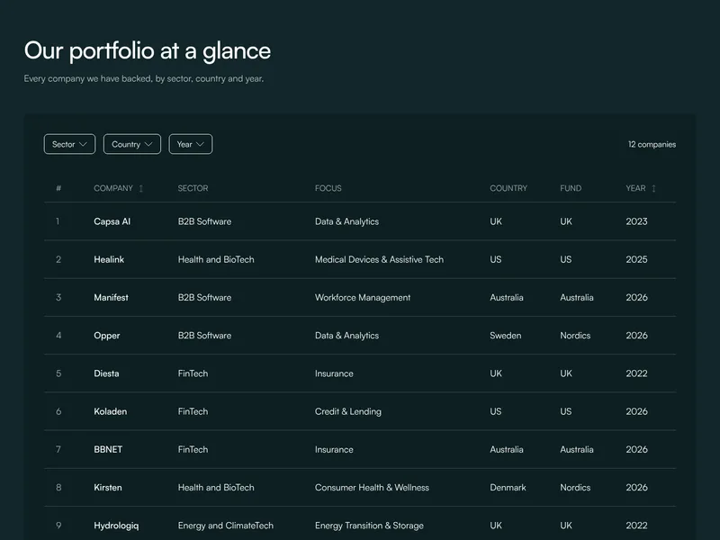
Company cards in a grid, nine at a time with load more.
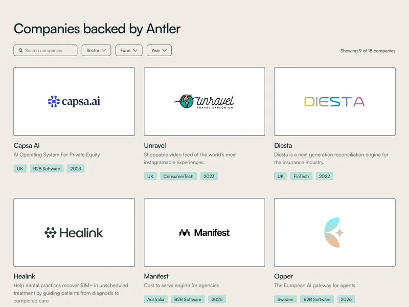
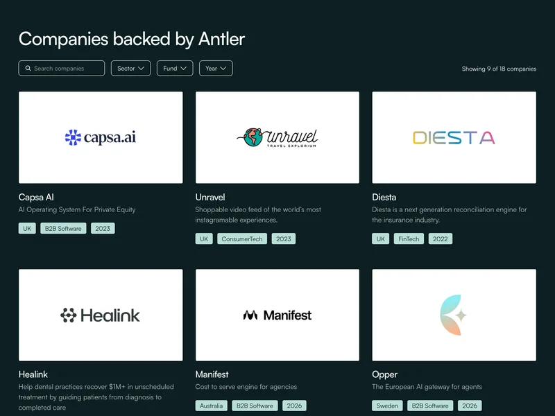
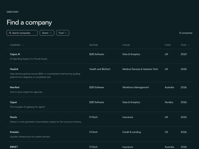
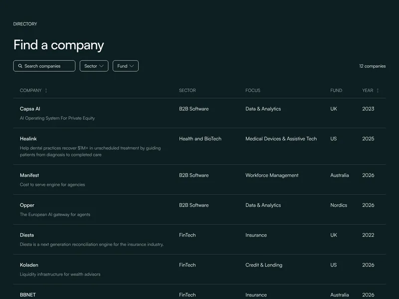
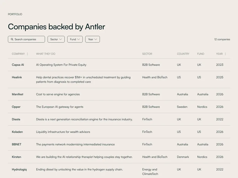
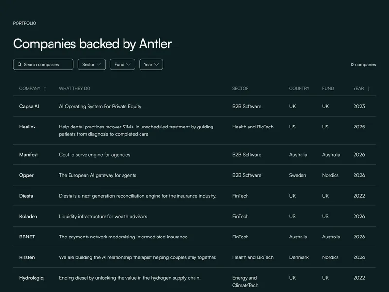
Company cards with search and filters, nine at a time.
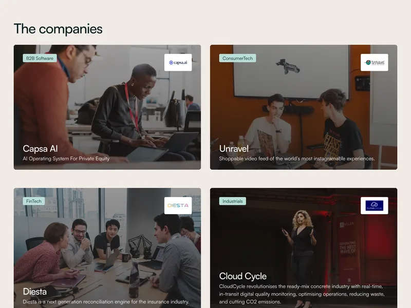

Company pictures with the name and line on them.
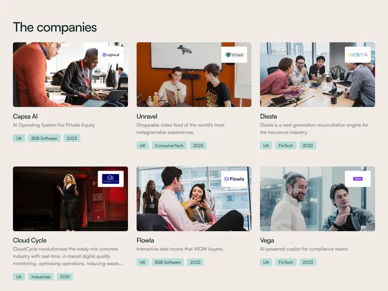

Company cards led by a picture, with a logo on each.
Blog header with one lead post and three more beside it.


Article cards with a picture, tag and date, in a slider.
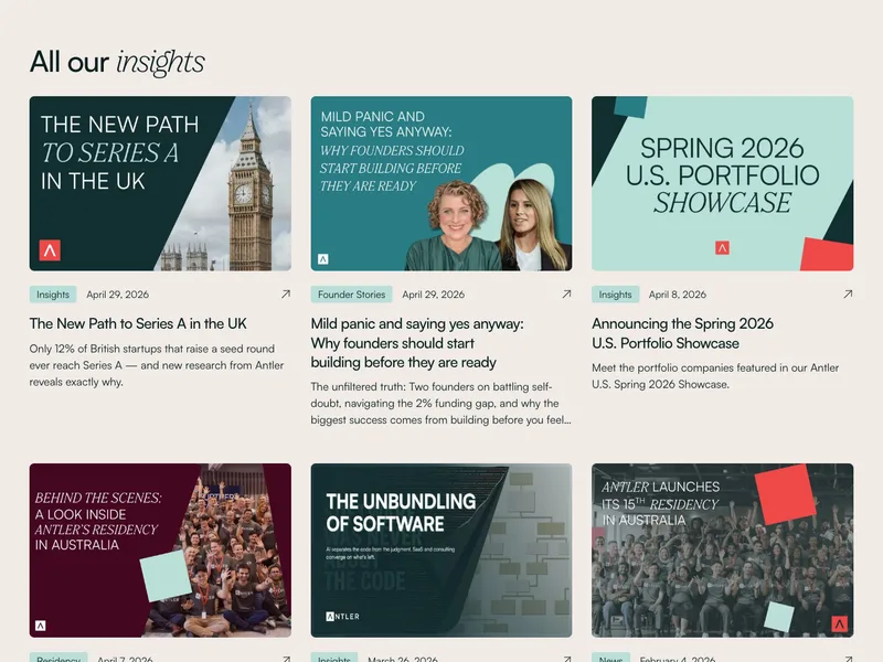
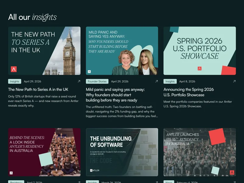
Article cards in a grid, nine at a time with load more.

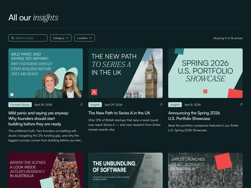
Article cards with search and filters, nine at a time.


One large article beside three smaller ones.


One large podcast episode beside three smaller ones.


Podcast episodes in a grid, nine at a time with load more.


Podcast episodes with a picture and date, in a slider.
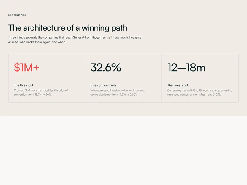
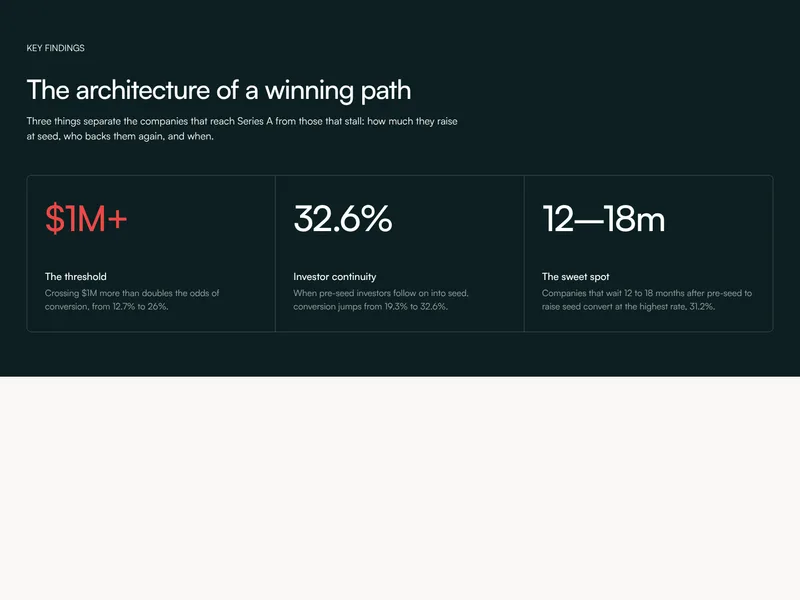
Three figures in a ruled panel, each explained.
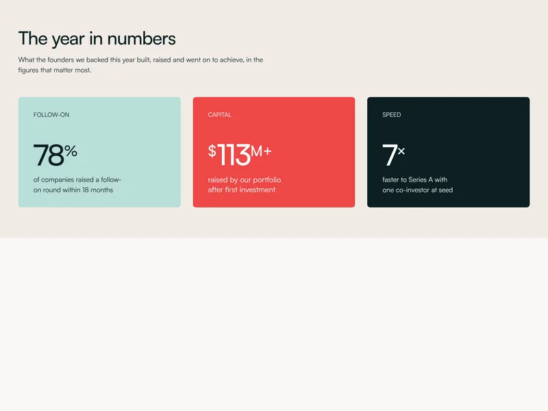
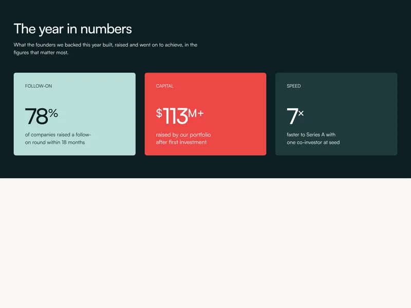
Headline figures as large, bold-coloured tiles.
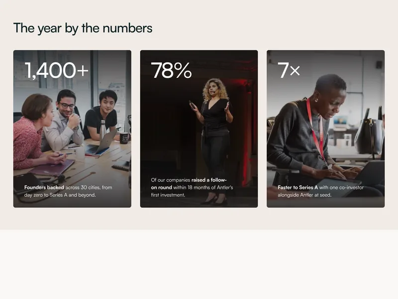
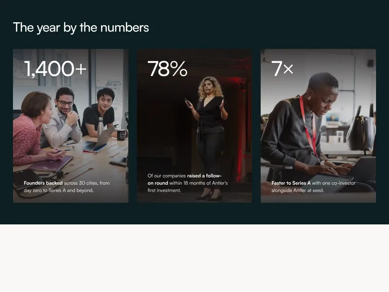
Headline figures on tall photo cards.
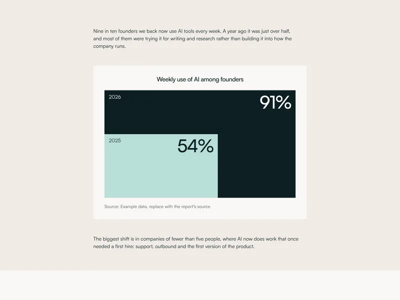
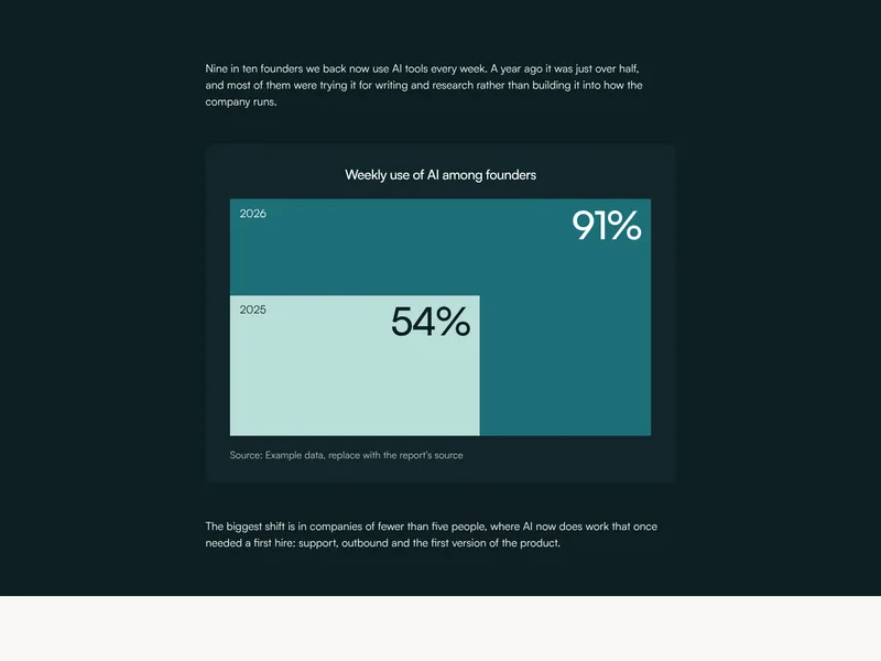
Two figures as blocks, one inside the other.
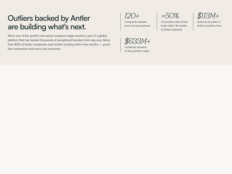
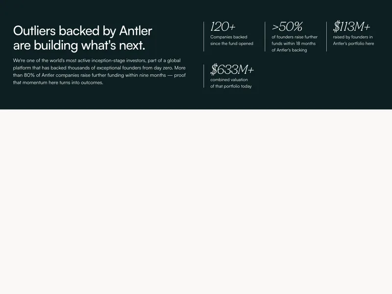
Numbers in a grid beside a heading and a paragraph.
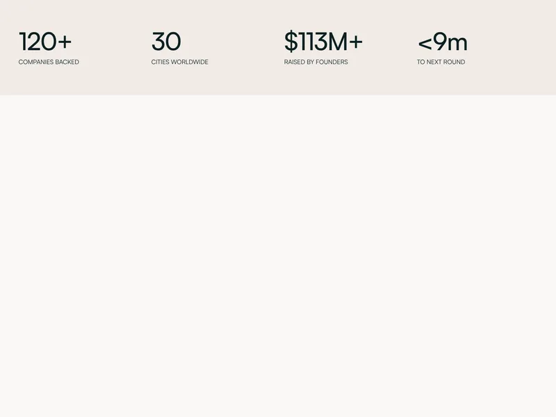
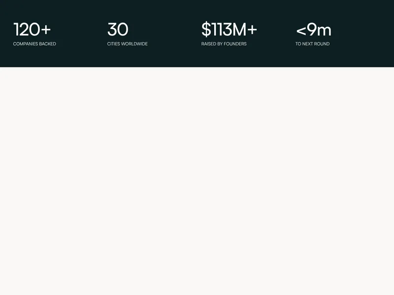
Four big figures across the page, each over a short label.
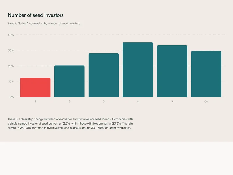
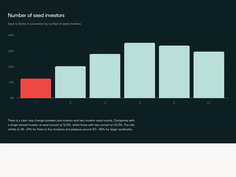
A bar chart with its heading, subtitle and reading.
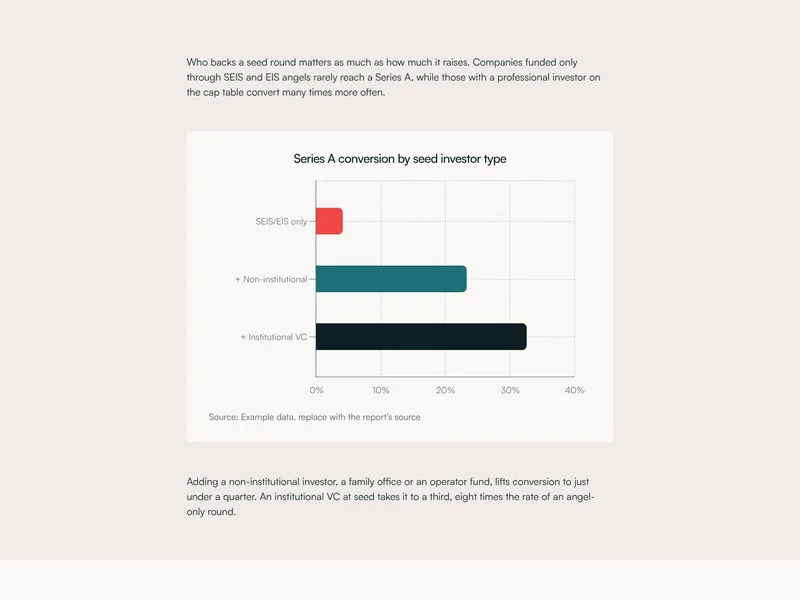
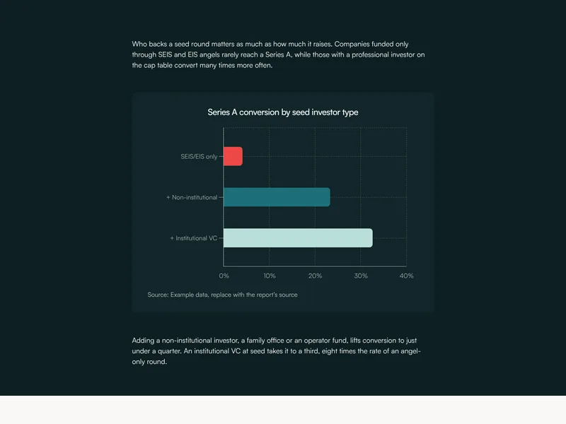
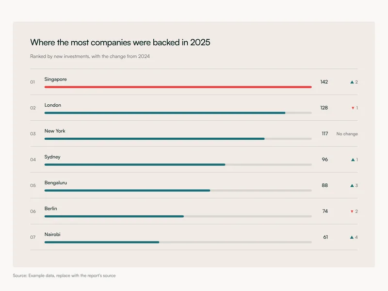
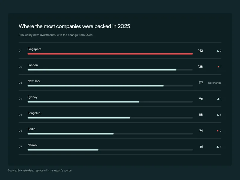
Bars on their side, a name to the left of each.
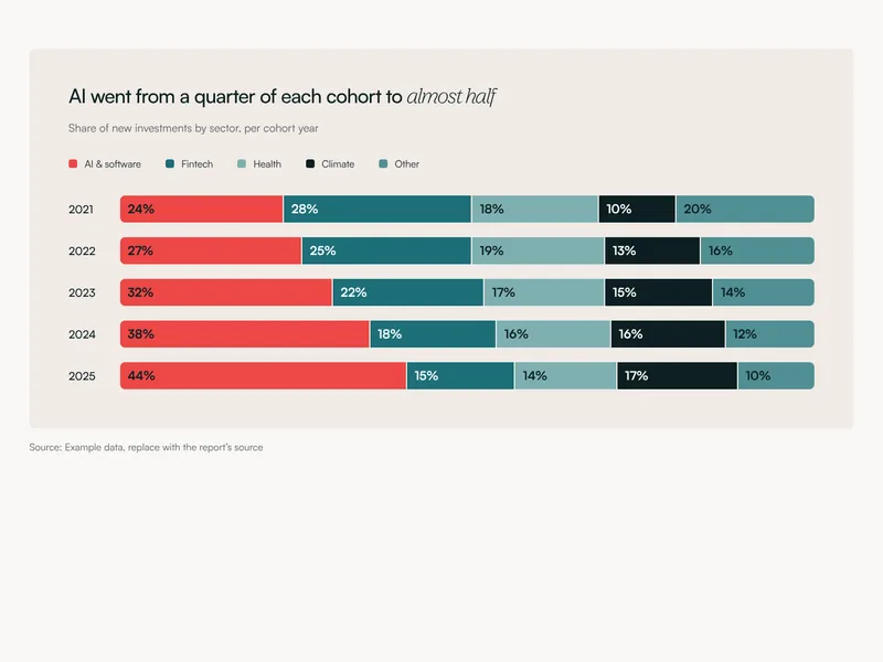
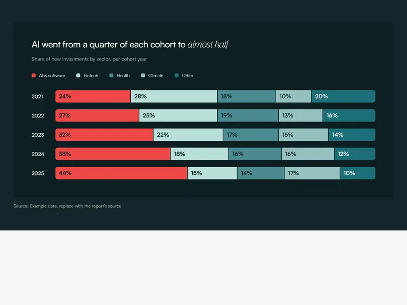
Bars split into parts, one row per year or group.
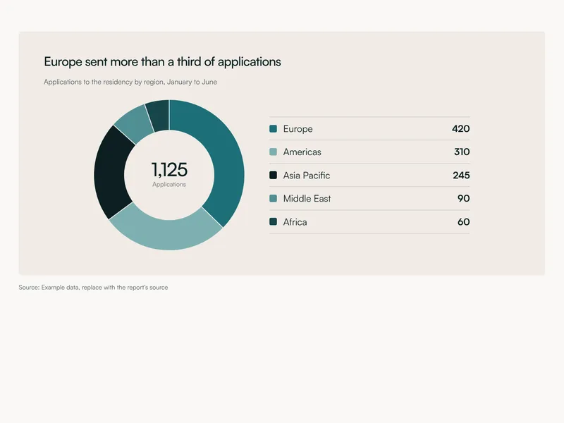
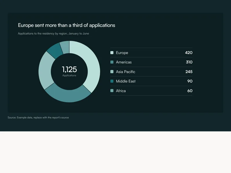
A donut with a figure in its middle.
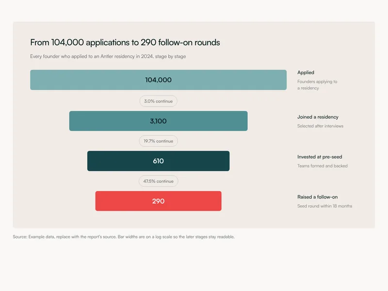
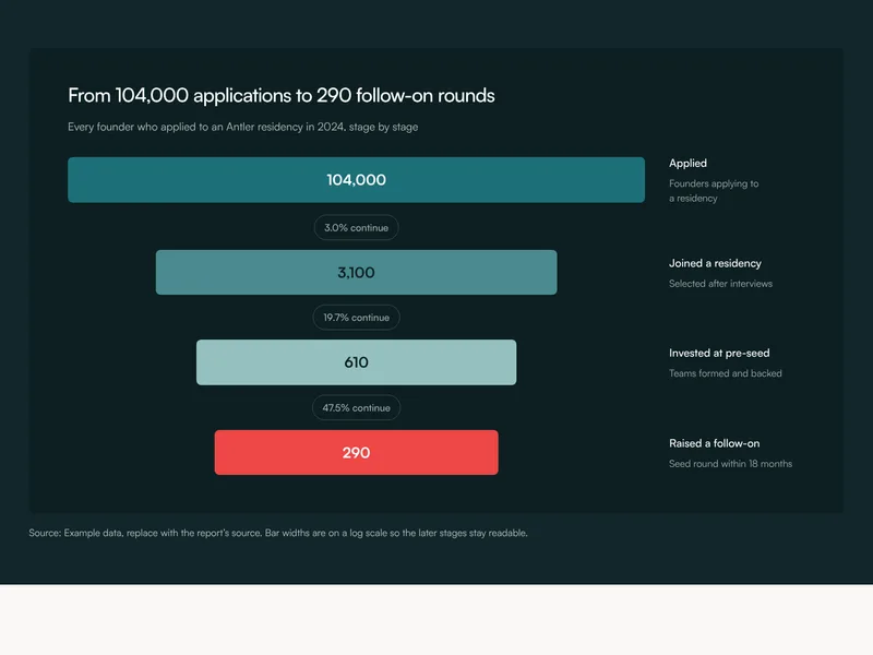
A funnel of narrowing stages, with the rate between each.
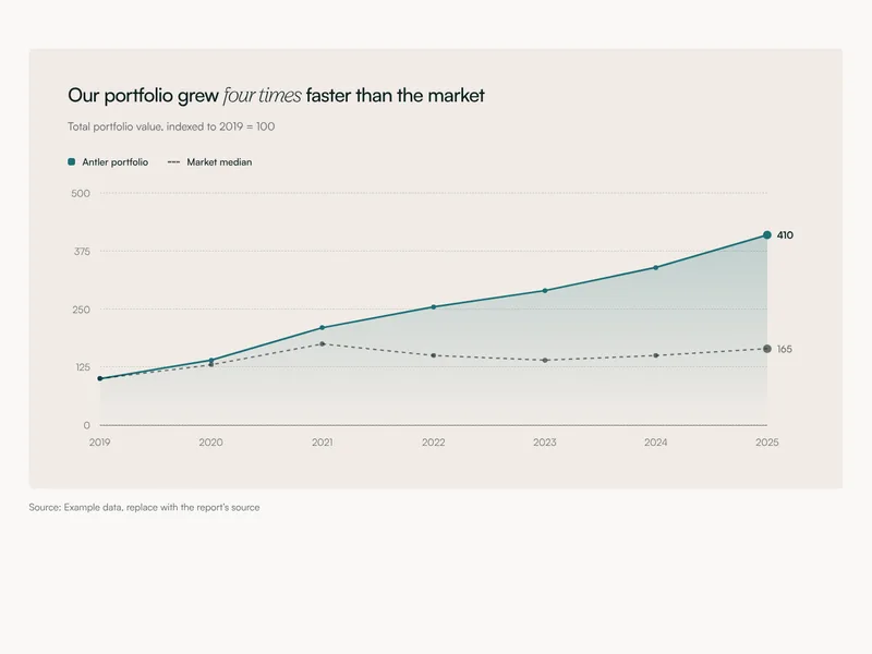
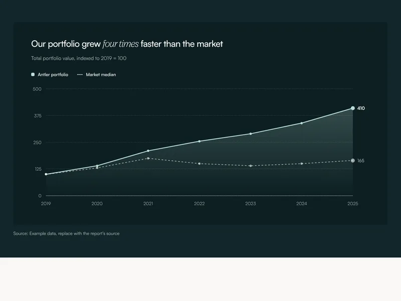
A line chart of a trend over time.
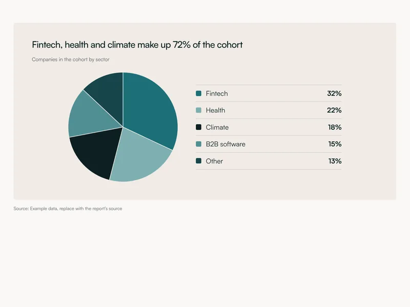
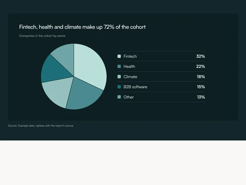
A pie chart and its key.
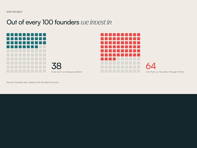
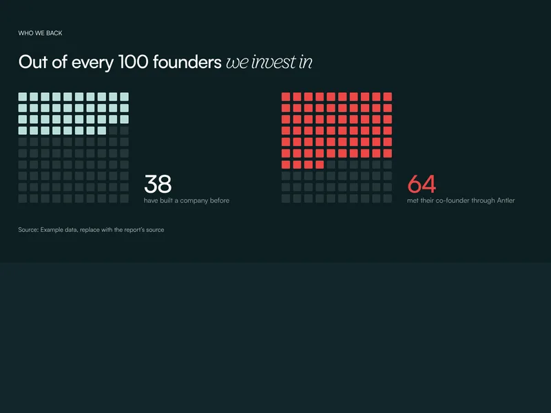
Shares shown as squares out of a hundred.